Age adjusted all cause mortality trends 2000-2021 in Europe
An analysis by 5 year age bins using ESP2013 and WHO2015-2025 standard populations
The following works was motivated by the current focus on the observed all cause excess mortality, e.g. in Austria and the Netherlands. Examples are: AT (and my quick review) and this article from NL. Those news were the motivation to analyse if there is an issue or not. In order to do this, we need to make a real age adjusted analysis and look at fluctuation trends from previous years.
1 Data preparation
1.1 Data Sources
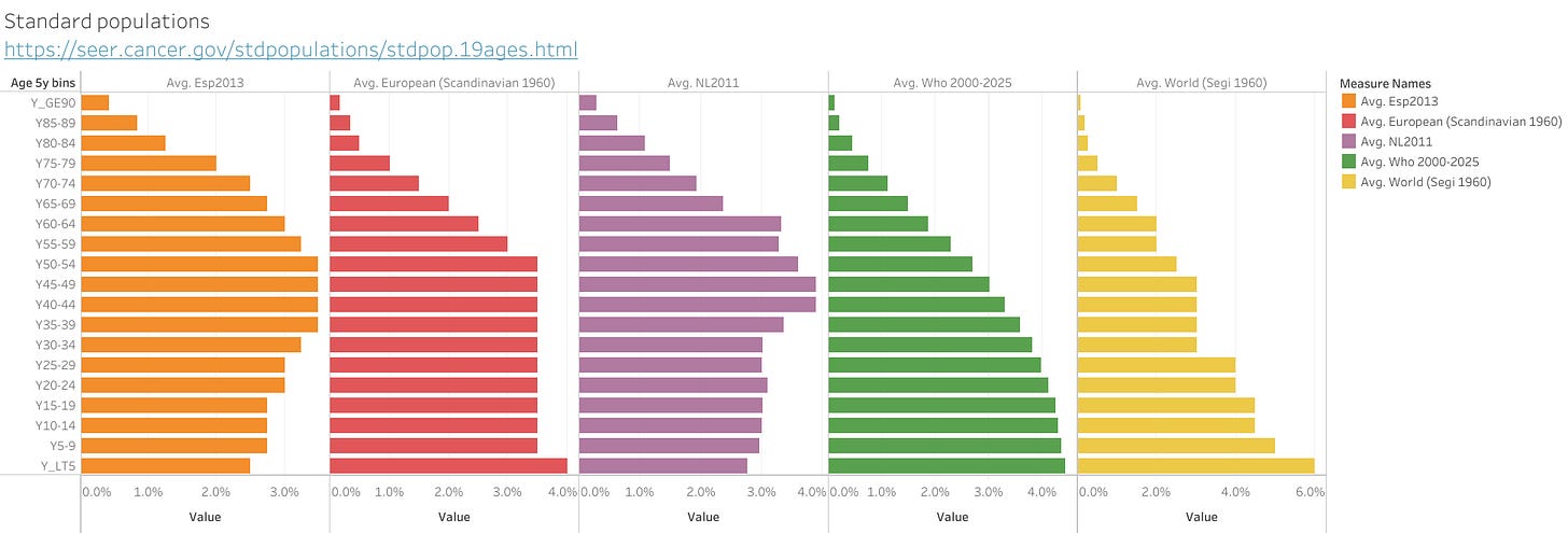
Standard populations:
https://seer.cancer.gov/stdpopulations/stdpop.19ages.html
Note: The last age group was split in two, a 85-89 bin (2/3 of 85+) and a 90+ bin (1/3 of 85+). The 2/3 and 1/3 value is based on the current relative populations observed in those age groups in Europe.
EU Deaths by week, sex, 5-year age group and country:
https://ec.europa.eu/eurostat/databrowser/view/DEMO_R_MWK_05__custom_1721660/default/table?lang=en
EU population by 1 year age group, sex, year, country):
https://ec.europa.eu/eurostat/databrowser/view/DEMO_PJAN__custom_1643622/default/table?lang=en
Note: The population for 2021 is not available yet. The 2021 dataset was created using linear extrapolation by age group using 2019 and 2020 population data (formula pop2021 = pop2020+(pop2020-pop2019)).
1.2 Standard populations
From the following source for standard populations, the below dataset was created. The last age group was split in two bins (to match the EC death age bins), a 85-89 bin (2/3 of 85+) and a 90+ bin (1/3 of 85+). The 2/3 and 1/3 value is based on the current relative populations observed in those age groups in Europe. In addition, a new empiric reference was generated from the NL 2011 population which is here named NL2011 (it is relatively close to ESP2013 as can be seen). As expected, the WHO and World standards are giving a higher weight to the younger population. The same is true for the older standards from 1960.
1.3 Population pyramid evolution
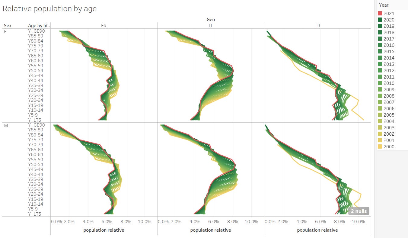
The below graph shows the evolution (aging) of population over 20 years for selected countries. Each line is the relative population pyramid with respect to the total population for that year. Obviously, the baby boomers will age and die over the next decades. While they will be moving up as aging, “mass dying” (in absolute numbers) and increased ICU load is unavoidable.

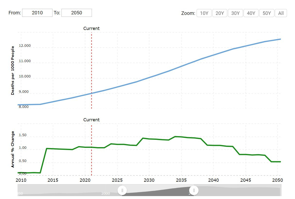
This aging of the baby boomer group, will bring us record mortalities (in absolute age unadjusted numbers) every year for the next 20 years in Europe as consequence of the boomers moving through the end of life age. Graphs as here below, therefore make little sense for the general public.
What matters is the life expectancy and the age adjusted mortality. Here the forecast looks normal. Life expectancy will keep increasing, and the population normalized mortality in each age group will continue falling. The only thing that must not be done is taking unadjusted averages as this creates a Simpson’s paradox (suggesting that there is a strange unknown cause for mortality like a virus, although it’s simply a statistical error).
A special focus will be given to the below countries.
Europe is an aging continent with low birth rates in general (France being less impacted). The most extreme case is Italy. Turkey in contrary, has a very young population.
The upcoming “dying” when the boomers move through to end of life shall not be a reason for panic and even less for locking down the few children that we have. What did we expect will happen when the boomers move through the 70-90 year age bins? Overloaded ICUs while boomers hit their terminal phase which is induced by one or another illness. The solution are not winter lockdowns, school closures, mask mandates or vaccine mandates. Scaling up elderly health care infrastructure is the only solution.
1.4 Mortality - a helicopter view
After joining the data sets we can now visualize the weekly mortality (population normalized). Red line is for 2021, purple for 2020. Top row is females, bottom row males. A closer look to AUT and NL makes clear why we see some articles worrying about all cause excess mortality. Examples are: AT (and my quick review) and this one NL. Those news were the motivation to look a bit more professional to this observation and to analyse if there is an issue or not. In the below graph, we see the total mortality. Adjusted by population (for each year) but not age standardized yet. Moreover, as usual, this mortality should be dominated by the elderly bins. But we shall go in more detail below.
2 Testing and validation of data model, adjustement methods and aggregations
2.1 Study subset (mortality)
In order to benchmark countries for 2021, we need to check the availability of data in EC.stats by country as they report with various delays. As of the 2021/12/07, this data was available for the selected countries. For benchmarks involving 2021, we will continue only with those with have data up to week 44 (07-11-2021). We will filter out the data beyond week 44 (2021) for those is available in order to allow time frame equal comparisons. It shall be mentioned, the latest data (latest weeks) may be subject to delayed reporting and not yet settled. But considering that this is now being of general public interest, we will have a look nevertheless and re-asses later (in a couple of weeks) again. Hunting a seasonal wave in the middle of a wave may generally be misleading when comparing countries in the middle of their waves which are delayed in time and impacted by the reporting infrastructure in each country (some may have a better and faster system than others).
2.2 Testing of the age adjustement
In order to test if the merged data sets are correctly, we visualize some test cases for NL. Red line is the actual population pyramid. Thick lines are the standard populations (ESP2013, WHO2015 and NL2011).
ESP2013 test
Below we test (consistency check) the age adjustment for NL data (as test case). With the standard population (NL2011), the raw deaths for 2011 overlay (yellow and purple line) with the NL2011 population adjusted deaths as expected.
More interestingly on the NL example by sex, we spot one (mis)feature of this mortality standardisation. The adjustment amplifies male deaths in the elderly (60+) bins. The reason for this is the asymmetry in life expectancy between women and men, while the standard populations are symmetric for men and women. Using symmetric standard populations for sex is “old men friendly”. It will be less sensitive towards elderly female deaths. The EC and WHO standardisation groups are advised to adapt and remove this artefact.
WHO 2000-2025 test
The WHO 2000-2025 standard population is not a suitable standard for high life expectancy countries in Europe. This is demonstrated on the NL example below. The red line is the result if adjusting deaths by the WHO standard population. The WHO population is heavily weighted on the young as mentioned above. It will be most sensitive towards child mortality and less sensitive on mortality in the elderly age groups. It “damps” the mortality in the 50+ groups. It’s probably fine for the use in regions where life expectancy is low. The WHO population is therefore not suited for Europe, likewise as ESP2013 isn’t suited for Africa.
Example: If we benchmark mortality of Italy (life expectancy 83 years) and Nigeria (life expectancy 55 years) using the WHO 2000-2025 standard population, it would make Nigeria look much better, that it really is. The WHO standard appears is designed for low life expectancy regions. It is more sensitive on infant mortality than on life expectancy. NL has a rather high infant mortality compared with European peers. The WHO 2015-2025 age standardisation should make this visible. For Sweden however, (with a low mortality among children and young) the WHO standard will make them look even better.
Summarizing: The WHO 2000-2025 standard population is not the right choice for analysing Covid-19 mortality which mainly impacts very old people (>70 years) with co-morbidities (vaccinated or not) as shown here and here by @mr_Smith_Econ. If we used this reference pyramid for analysing 2020/2021, most EU and US Covid-19 mortality would disappear as the elderly bin mortality is flattened out with WHO 2015-2025 standard.
The winner should be the country which does well on both ESP and WHO populations. In order to do well on both, one has to have a low infant mortality and a high life expectancy at the same time.
NL Age-standardized mortality rate (NL2011 versus crude mortality rate)
If the calculation is free of mistakes, the NL crude mortality rate (red) and the age standardized mortality rate (purple) using NL2011 population should crossover at year 2011. Reult: as expected.
Remark: WHO2015 flattens mortality in the elderly bins resulting in a lower mortality after standardisation as explained theoretically above but now demonstrated on real data below.
Age-standardized (ESP2013) mortality 2020 versus www.cebm.net
Here we test the age adjusted mortality for 2020 against a public source. While we have a reasonable match, we do observe some small differences. The reason for this is a too coarse age bin utilisation in the method used by www.cebm.net.
When reviewing their age adjustment method, we see that too wider age bins for averaging (maybe even the same wide bins for the source of death data) and adjusting are used. In particular, the 15-64 years age bin is too big as visualized below on the example of FR for 2020. With 5 year granularity we become a more precise result.
Using such large age bins as done by cebm, creates statistical averaging errors and potentially a Simpson’s paradox in the same way as we have seen it with the UK PHE data (also using one bin only for age 15-64 years).
This becomes even more clear using a log scale. Aggregating mortality BEFORE (as done by CBEM and UK PHE) adjusting by age through a standard population weighted adjustment by fine 5 year age bins will be dominated by the mortality of the older groups in this age group.
The correct method is: age adjust mortality by fine age (as fine as available) bins BEFORE aggregating all age bins into one mortality number.
Comparison (update 26.12.2021) with mortalit.org
In the following we compare the more basic part of the calculation, prior to applying weighting by the standard populations. We compare the co called “age specific death rates” with the results from mortality.org. The motivation for this test, is to validate the correct use of the raw death and population data. The specific test case is for Netherlands, weekly graphs for year 2020 and 2021 for the age group 85+.
Our results for females 85+ is shownbelow. Note that the units in mortality.org are per year and per 100k. In most of our visualisation we do not normalize to yearly units, but remain with the units at the corresponding granularity of the time range. For weekly data, we remain in weekly units. in this special case, for the sake of comparison, we us the same units.
In the following we overlay our results in the middle graph, females and obtain a perfect overlay.
This is surprising as slight differences for 2021 may have been expected due to the potential estimation differences of the 2021 populations between LaabOrwell and mortality.org. In our case, we linearly extrapolate from 2019 and 2020 in order to estimate the not yet available 2021 population. Mortality.org most likely use detailed population evolution models to track changes on a monthly or even weekly level. We keep the population constant (as per EC database) for the entire year in each year as we consider the resulting errors from this negligible (seems confirmed by the perfect matching of the overlay test).
Comparison (update 7.02.2022) versus ONS
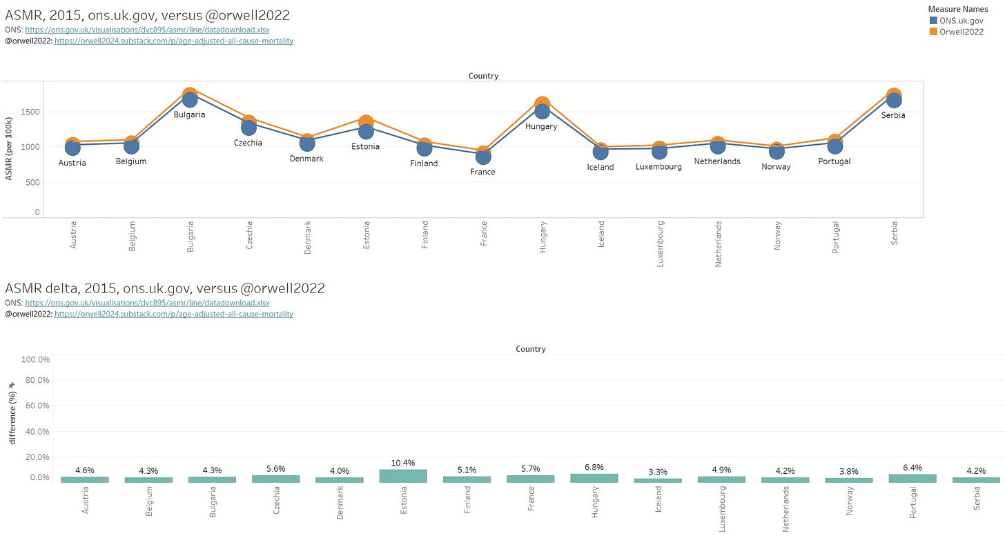
Update, thanks to @OS51388957. We can now directly compare with ONS, who present Weekly ASMR, using 2013 std population for all European nations with EC data.
https://ons.gov.uk/visualisations/dvc895/asmr/line/datadownload.xlsx
Here an example for week 2, 2015. Potential difference may come from the population estimates. In our case, we keep population constant over 52 weeks, and change it only in week 1 of the new year (which makes a step of course). ONS may have smoothened / interpolated the yearly changes over the weeks.
The comparison on yearly aggregation gives the following. There is a small, but systematic bias. Otherwise, we get a nice agreement. The bias root cause may be due to difference in: population estimates (weekly versus yearly), bin size (maybe ONS uses 0-1y separately while we do 0-4y in one bin), last (infinity) bin choice, std. pop.
3 Analysis and results
3.1 Crude weekly mortality versus age standardized weekly mortality
We can now compare the crude weekly mortality (top row) versus the age standardized mortality by week (mid row for ESP2013, and bottom row WHO2015). As expected, WHO2015 will iron out the seasonal deaths as it’s not weighting the elderly bins. It’s not a suitable standard population for Europe with strong respiratory virus induced seasonal mortality waves (which impact the 70+ mainly).

We further see that Sweden is outperforming all neighbours in 2021, even Norway. This is likely an anti-correlation with the cumulative stringency of lockdowns.
Furthermore, we see that disastrous performance of Slovenia who imposed some of the strictest lockdowns last year and announced the end of the pandemic in 2020 May. They used to be the role model for having prevented the first wave with lockdowns, but paid a high price with world record mortality in autumn 2020. Lockdowns do not prevent mortality, in contrary they only delay it making the situation worse when applied over a prolonged time.
When splitting this by sex, we furthermore see the above mentioned problem with the use of symmetric standard populations like ESP2013 which amplifies the mortality for males and makes the female mortality less weighted. It gives a higher importance to old male mortality as theoretically explained above and here demonstrated on data.

A closer look on the 3 countries of interest: AT, NL, SWE.
3.2 Mortality trend (crude and age standardised) by year
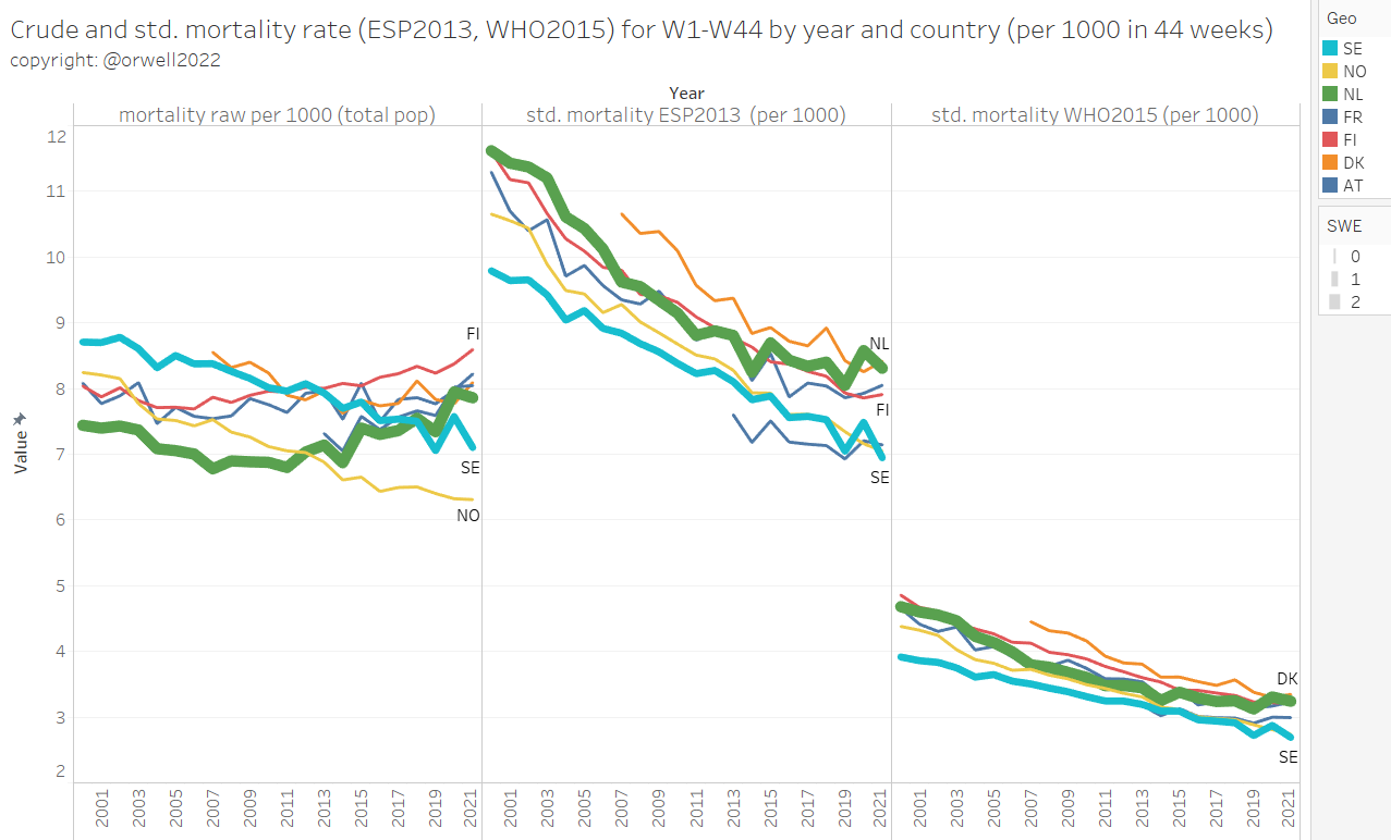
After aggregating by year we get the 20 year mortality trend over two decades 2000-2020. Year 2021 is excluded, as only 44 weeks are available.
Remark: WHO2015 flattens everything as the Covid-19 mortality in the elderly bins isn’t highly weighted. On WHO2015 standard, Sweden outperforms all with their systematic lower infant mortality and low mortality among the young.
In order to allow showing the trend with 2021, we exclude weeks 45-53 from all years in order to compare 2021 with the same 44 weeks time frame from previous years. Sweden did best while being almost completely open in comparison with peers. Very clearly FI and DNK are a worse (they have a life expectancy which is almost 2 years lower compared to Sweden).
3.3 NL age standardised mortality
Year 2020 stands out a bit even when age adjusted. It’s however not as bad as percieved. It’s on pair with year 2009/2010.
The above mentioned problem with the use of symmetric standard populations like ESP2013 which amplifies the mortality for males and makes the female mortality less weighted, is in particularly visible for the 90+ age bin. Male life expectancy is lower. We shouldn’t amplify a problem which is rooted in biology. The standard populations should be changed accordingly.
Younger age bins as the 20-24 year bin, will obviously not have this issue as shown below.
The 2020 excess mortality is mainly dominated by the elderly groups. This is shown below.
If we zoom in on the 65+ bins only, this becomes clearer.
Covid-19 and the seasonal winter excess mortality is impacting almost exclusively the elderly. Below 60 (grey part), no seasonality is visible. Yet, this is the age group which is now most aggressively being pressured to vaccinate against Covid-19 by QR passports and dystopian coercive measures.
By excluding the 60+ bins, we can make this better visible. The mortality spike in 2014 is the MH17 airplane incident. As we can see, both crude mortality and the age adjusted mortality will hide this spike in the young group. While we can see such an event in the raw data, the “great pandemic” is not visible for the age group younger than 60. This is the reason why countries with young populations (like Africa) have not been impacted by Covid-19 excess mortality.
3.4 Age standardised mortality country comparison (2020 and 2021)
2021 weeks 1-44, detailed look by age
Motivated by the current focus on the observed all cause death excess mortality, e.g. in Austria and the Netherlands we now look in depth by age to analyse if there is an issue or not. In the group below 60, nothing abnormal can be seen.
Take this part with some care as the raw death data for 2021 can still change (reporting lag). The dips at the end of the graph for some countries, may be (or likely is) such an reporting delay undercounting artefact.
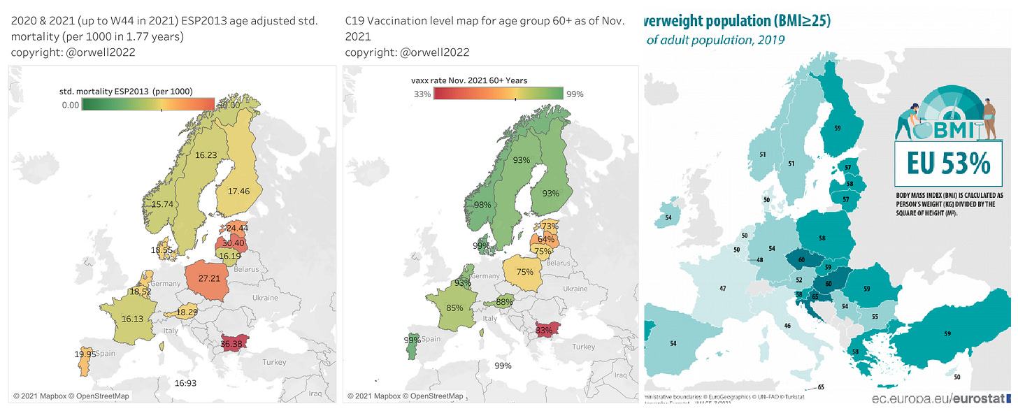
The observed excess mortality in all cases (also Austria and Netherlands), is entirely dominated by mortality in the elderly age bins. Those are 95 % vaccinated. The same vaccination level is also the case in Sweden, Spain and France. The vaccine doesn’t reduce nor increase mortality. It isn’t the underlying root cause. The most likely hypothesis has been discussed above: lockdowns or random seasonal effects.
3.5 Age adjusted mortality 2020-2021
If we take the full pandemic time frame over 96 weeks (2020 W1-2021 W44), we get the following scoreboard. As mentioned above, many countries had to be excluded due to limited availability of mortality data for 2021.
For reference, using WHO2015, we get a slighltly different ranking while overall the ranking seems robust despite using very different standard populations. With WHO2015-2025 standard populatio, Sweden gets rewarded for the (consistently) lower mortality in the younger age groups.
France: That suprised me.
We can visualize this on a map (left) view versus vaccination level in the elderly 60+ years risk group (mid) and BMI (right). There is no real correlation with vaccination levels. But there seems to be with BMI.
3.6 Age adjusted mortality 2020
Last and best, in order to allow comparison with external source, the ranking for 2020. To my knowledge, this is the most precise data of this kind, as I have not seen any age standardised mortality done on the granularity of 5 year age bins elsewhere. As we can see, panic and hard lockdowns did not reduce mortality.
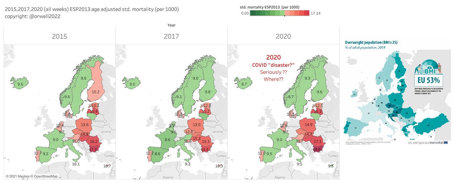
At the same time we see that France did well despite rather strict lockdowns. That was unexpected from my side. I did not have them “on the radar” for doing well. But they do. So my lockdown hypothesis did not hold as expected.
We became more curious about France and with some hints from readers we may have found their secret. Anyone who has lived in France knows their outperformance on food culture. Personally, I prefer Italian and Spanish kitchen. But let’s be clear that in recent days, Italian and Spanish food is heavy on carbon hydrates and fried fat compared with traditional food in France.
We therefore visualise the age adjusted standard mortality on a map now for 2015-2020 with an obesity map side by side.
Disclaimer: Being obese is fine for me. Im’m not judging but analysing. I believe in freedom to live as people choose to do. But I also believe in personal accountability. When an aging obese oversupply society is later blaming healthy people and children it becomes malfeasance and is morally seriously wrong.
When people turn 70-80 no vaccine will bring down the risk to the level of someone who hasn't “lived a life of sins”.
4 Summary
La grande surprise, the main surprise was France. But also Switzerland. I didn’t expect that and though: what are those two doing in the lead of the ranking?
I went into this work with a Sweden bias and the expectation / hypothesis to find a negative correlation with lockdowns. The data told us a different story and surprised us with a much stronger apparent underlying cause: obesity.
Sweden did best considering the very modest approach. They could have done better in elderly care settings to flatten the sharp peak in 2020. But nobody else managed that neither. The one shoe fits all approach made the better strategy, focused protection (as recommended by the Standford groups), difficult.
What is interesting is that at least in the wealthy countries, the expected lockdown harm doesn’t show up in all-cause mortality. Rich countries like Norway, Switzerland and France can obviously afford such (to my view counterproductive) measures. I still expect, that it’s devastating in poor countries like India and Africa.
The driving motivation in doing science is being surprised and to find the unexpected and having views challenged by the data. In order to do that, one needs an open mind and the willingness to adapt conclusions based on new insight and not the do it the other way around (pushing a narrative).
La grande surprise, the main surprise was France. But also Switzerland.
Expectation / hypothesis to find a negative correlation with lockdowns was challenged by data which told us a different story and surprised us with a much stronger apparent underlying cause: obesity.
2021: Neither a positive nor negative impact of the vaccine can be seen. At least it’s not of any relevant dominance on a yearly base level. Other causes dominate. Probably lockdown, or random seasonality as also lockdown hardliners like France and Spain are doing ok for now. Detailed time window analysis by age may find 2nd order some effects. Maybe we will see the male heart (post dose 2) problems for the 18-30 years cohort (in a time window analysis). And we should see some benefit in 70+. That are the 2 trails. In the 30-70 year cohort it likely impossible to see anything.
Sweden is outperforming in 2021 (even all it’s neighbours), despite the Sweden denial in MSM.
2020: The age adjusted mortality demonstrates the overreaction in the Covid-19 crises.
The standard populations should be adapted to a more female friendly asymmetric sex population pyramid. In particular for the old ESP2013 population in the elderly bins above 50-60.
WHO2015 is not suited for countries like Europe. Yet, the country ranking is robust, even with the use of such different standard populations as ESP2013 and WHO2015-2025.
The observed excess mortality in Austria and Netherlands, is dominated by mortality in the elderly age bins. Those are 95 % vaccinated like in Sweden, Spain and France. The vaccine doesn’t reduce nor increase all cause mortality. It isn’t the underlying root cause. QR passports and the one dimensional panic driven C19 health focus has to stop.
Aging populations in Europe and the upcoming baby boomer ICU and death wave: Records in absolute age unadjusted numbers every year for the next 20 years in Europe is unavoidable. This is normal and simply the result of the boomer group moving through the end of life age bins. In order to avoid a general panic every winter, mortality must be age adjusted or even better only analysed by age group and not aggregated into one total number mortality or mortality rate number. Do not panic based on a Simpson’s paradox. Scale up health infrastructure to face this wave of an aging population (and the resulting increasing need for ICU capacity as those get terminally or severely ill).
“A baby boom obviously follows by an elderly boom at some point.” And this makes an ICU and death boom at the end.
So who will win the ranking? We will see. A final between Sweden, Switzerland and France for the lowest mortality place is my bet. The penalty (the comma) will decide.
Allez les bleus!
4 APPENDIX: Tableau data model and calculations
Tables join
Tableau Calculations
"pop pyramid year":
{FIXED [Time Period], [geo (population!5Ybins)],[year (population!5Ybins)],[Age 5y bins], [sex (population!5Ybins)] : SUM([Population])}/[total pop fixed by geo]

"total pop fixed by geo":
{FIXED [Time Period], [geo (population!5Ybins)],[year (population!5Ybins)] : SUM([Population])}

"std. mortality ESP2013  (per 1000)":
[deaths raw]*[Esp2013]/[pop pyramid year]/[total pop fixed by geo]*1000

"mortality raw per 1000 in age bin":
[deaths raw]/[Population]*1000

"deaths ESP2013 adjusted":
[deaths raw]*[Esp2013]/[pop pyramid year]

mortality raw per 1000 (total pop):
[deaths raw]/[total pop fixed by geo]*1000

mortality raw per 100k in age bin (per year)
SUM({FIXED [Year],[Week],[Geo], [Sex], [Age 5y bins]: SUM([deaths raw])})/SUM({FIXED [Year],[Week],[Geo], [Sex], [Age 5y bins]: SUM([Population])})*1e5/7*365

### calculations by season: the week offset trick
### "offset" is a variable

Date -offstet
DATEADD('week',-[offset],[Date])

seasonal deaths ESP2013 adjusted
[deaths raw]*[Esp2013]/[seasonal pop pyramid year]

seasonal std. mortality ESP2013  (per 1000)
[deaths raw]*[Esp2013]/[seasonal pop pyramid year]/[seasonal total pop fixed by geo]*1000

seasonal total pop fixed by geo
{FIXED [Week - offset], [geo (population!5Ybins)], DATEPART('year', [Date -6 months]): SUM([Population])}

seasonal pop pyramid year
{FIXED [Week - offset],[geo (population!5Ybins)],DATEPART('year',[Date -6 months]),[Age 5y bins], [sex (population!5Ybins)] : SUM([Population])}/[seasonal total pop fixed by geo]
EC Mortality table
EC Population table
Standard population table
And my (messy) dashboard.
It’s a working dashboard. More for myself rather that adapted for publication.












Outstanding job! I really appreciate it.
Well done that is excellent. Hope it goes a long way to dispelling the fearmongering and help people look at reality objectively again. Thank you!