Age Standardised Mortality Rates (ASMR) using HMD (mortality.org) raw data.
Including a DIY appendix
Introduction
You may have seen our article on age standardisation of mortality rates. In my approach, we used the most fine available raw data from https://ec.europa.eu/eurostat where both deaths and population data is available in 5 year age bins or finer.
This approach is the most accurate way to calculate ASMR. The drawback is the limited number of available countries. Even some European countries, like Germany, Ireland (their own infrasturcture looks very advanced) and UK are missing. The most likely explanation for this, is the lack of motivation from those countries to duplicate (also to translate from their own language and metric) work as they have their own national infrastructure available. Small countries seem to use this offer by EC as it gives a direct benefit (e.g. as not having the resources to maintain comparable national infrastructures). In other words, the issue is harmonisation. A typical challenge in Europe.
There is an easier approach to get access to more countries, namely the use of the age banded mortality rates from mortality.org. The main drawback here is however the larger age bins available. In particular the one bin for the age group 15-64 is far to wide. For countries with a young population and low life expectancy, using this set to age standardise is basically not meaningful and can’t really be called age adjustment.
For Europe, USA, Canada this approach however gives a reasonably accurate result despite using larger age bins which we show below. It is certainly much better than working with the crude mortality which is hugely age confounded and meaningless for cross country and across time comparisons.
Results
Let’s avoid a TL:DR and move to results first. The details of the calculation can be found in the appendix.
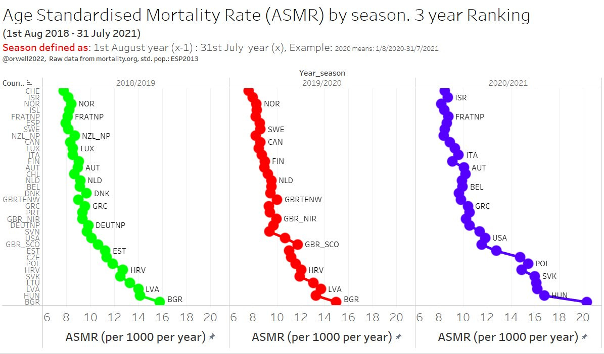
We can now create a new 3 season mortality ranking that includes more countries than the original article. The main highlight is having Germany, UK, Canada and USA included. Those are the countries with a prolonged lockdown approach, and are therefor important to benchmark. How did they do? Be the judge yourself.

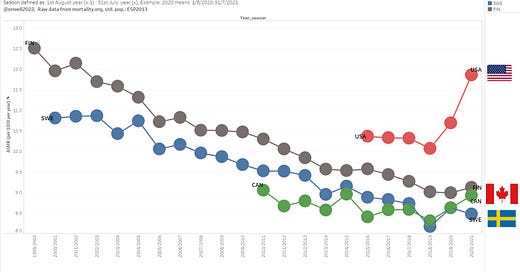
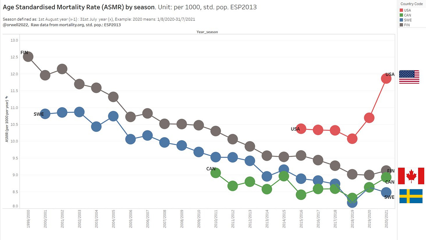
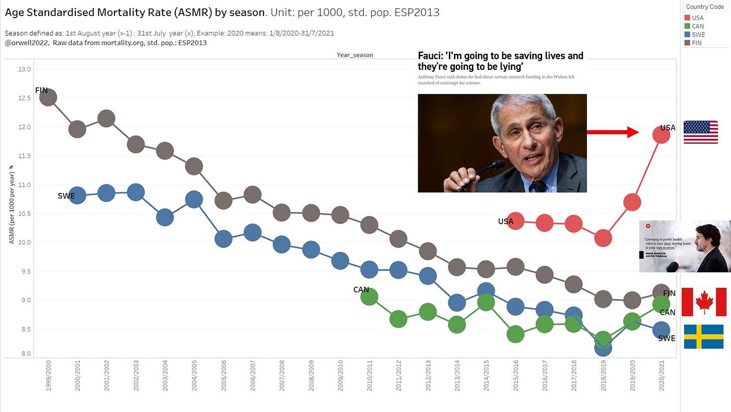
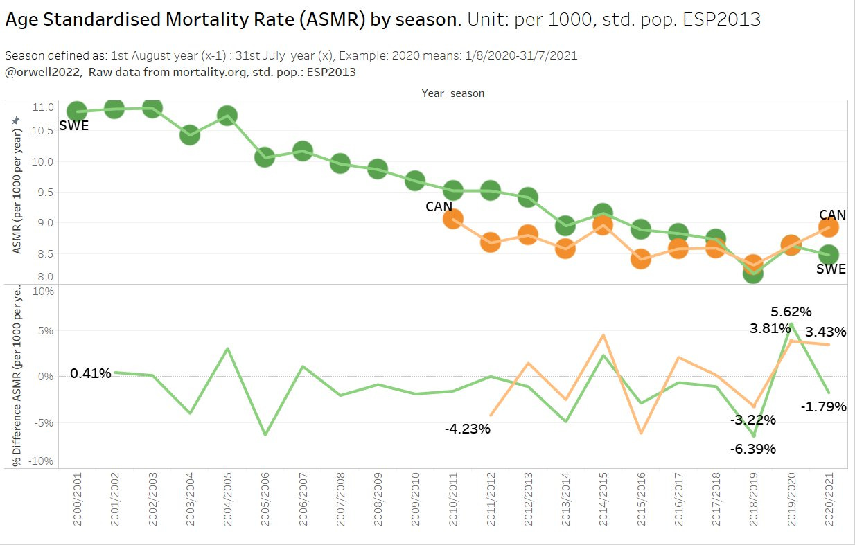
Surprise: Even Canada has fallen behind Sweden. So let’s take a deeper look ino this and plot the mortality trend. Similar as all lockdown countries, USA and Canada seem to have moved into a broken trend upwards for 2 years in a row, while Sweden only had a bump in line what is typically happening in stronger seasons.
What is happing in USA is simply a tragedy. The one parameter health focus and the 2 year long panic around it, is the most likely explanation. It has been predicted in 2020 by many, like Martin Kulldorff, Michael Levitt and Jay Bhattacharya just to mention a few of many. We can now see the catastropic result ressulting from hysteria.
Unfortunately, the vast majority of countries followed this wrong approach. The results speaks for themselves. All-cause mortality is drastically going up for 2 seasons.
There is a good reason for why we call all cause mortality like this. Mortality and health is driven by all kind of causes, and certainly not by one cause / parameter (Covid) which unfortunately is the perception in countries like USA, Canada, Austria, Germany etc.
If you focus all your effort mitigating one cause, you may die from all kind of causes.
The end.
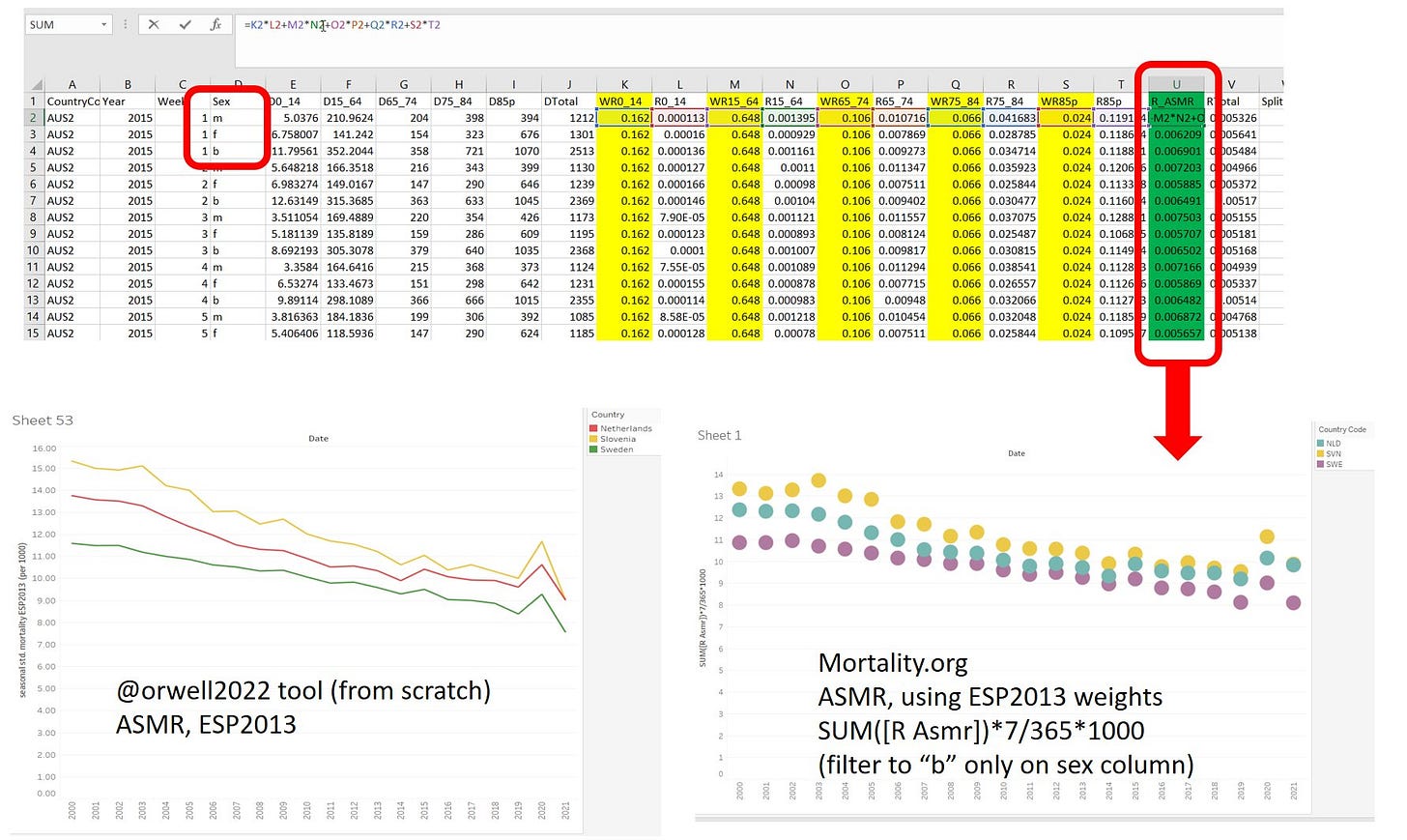
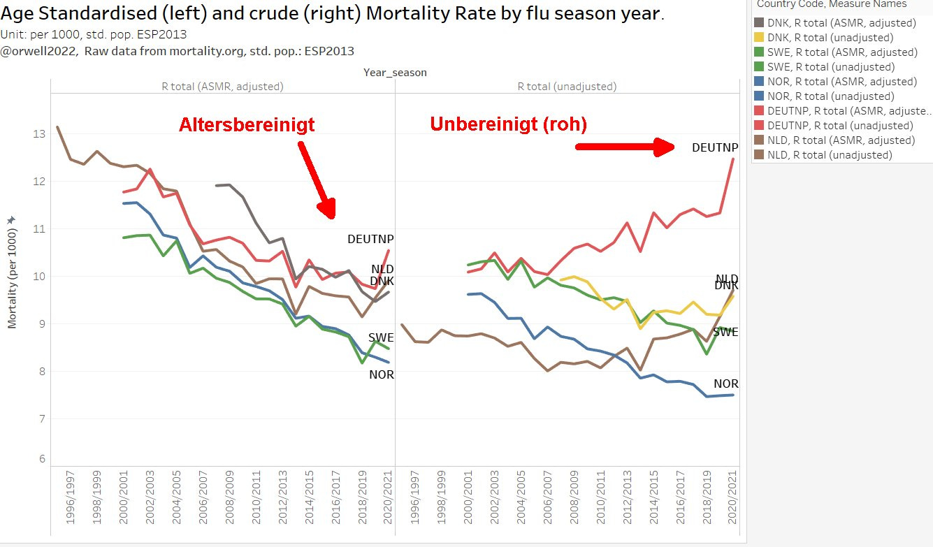
Update (4.2.2022, after writing a dedicated artice about New Zealand): The following graph demonstrates the Age Standardisation effect. On the left we see the ASMR (Age Standardised Mortality) and on the right the crude mortality as taken from source (mortality.org). Note that this is by calendar year.
Appendix - DIY
While the do it from scratch approach (the accurate way of doing it) in my original article required some work (1 week), using mortality.org raw data to create ASMR is straightforward (thanks for the hint by JM Pienar). The work was done in 30 minutes. Here I show you how it’s done.
1 Standard population
First you need to choose a standard population. There are many available. We go ahead with ESP2013 which is a good choice for most of the north hemisphere populations. We need to create a coarse version of this, in order to match the wide age bins of the raw data. We can do this with other standard populations if we wanted. But ESP2013 is a good “working horse”.
2 Raw data
The HMD raw data can be downloaded here. Now create columns with the weights (here in yellow) and the result ASMR column (here in green).
The formula is simple: multiply the age banded mortality rates with the corresponding weights of the standard population pyramid and we are done. (like this: K2*L2+M2*N2+O2*P2+Q2*R2+S2*T2).
The results are shown graphically on the right and for comparison on the left, the results as obtained with the precise method (5 year bins from ). The match is remarkable, despite applying a coarser methods.
3 Units and tricks
The raw data units are per year on a weekly basis. In order to obtain the correct unit when aggregating the data to a year (52 weeks), the following scale has to be applied, e.g. in Tableau. The resulting unit is then mortality per year per 1000.
SUM([R Asmr])*7/365*1000
Pay attention to the sex column. You need to filter to one of the options e.g. “b”. Otherwise you would be aggregating wrong.
I generally prefer analysing by flu seasons. A flu season is defined as the August - July 52 weeks timeframe. This is done by creating a week offset of 30 weeks.
Example:
2019 means 1st Aug 2019 - 31st July 2020.
2020 means 1st Aug 2020 - 31st July 2021.
The way to do this is Tableau is to work with date columns. First we ned to create a real date column, and secondly another date column with the offset to allow aggregating by season instead of calendar year (that’s the trick to allow profiting from the date aggregation function in Tableau).
Date:
DATEPARSE('w/yyyy',STR([Week])+'/'+STR([Year]))

Date - offset:
DATEPARSE('w/yyyy',STR([Week])+'/'+STR([Year]))

Year_season:
STR(DATEPART('year',[Date - offset]))+'/'+ STR(DATEPART('year',[Date - offset])+1)

offset:
30
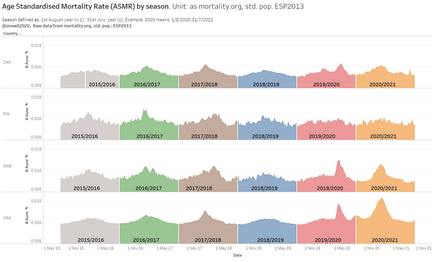
Once having seasons, we can create views like this:
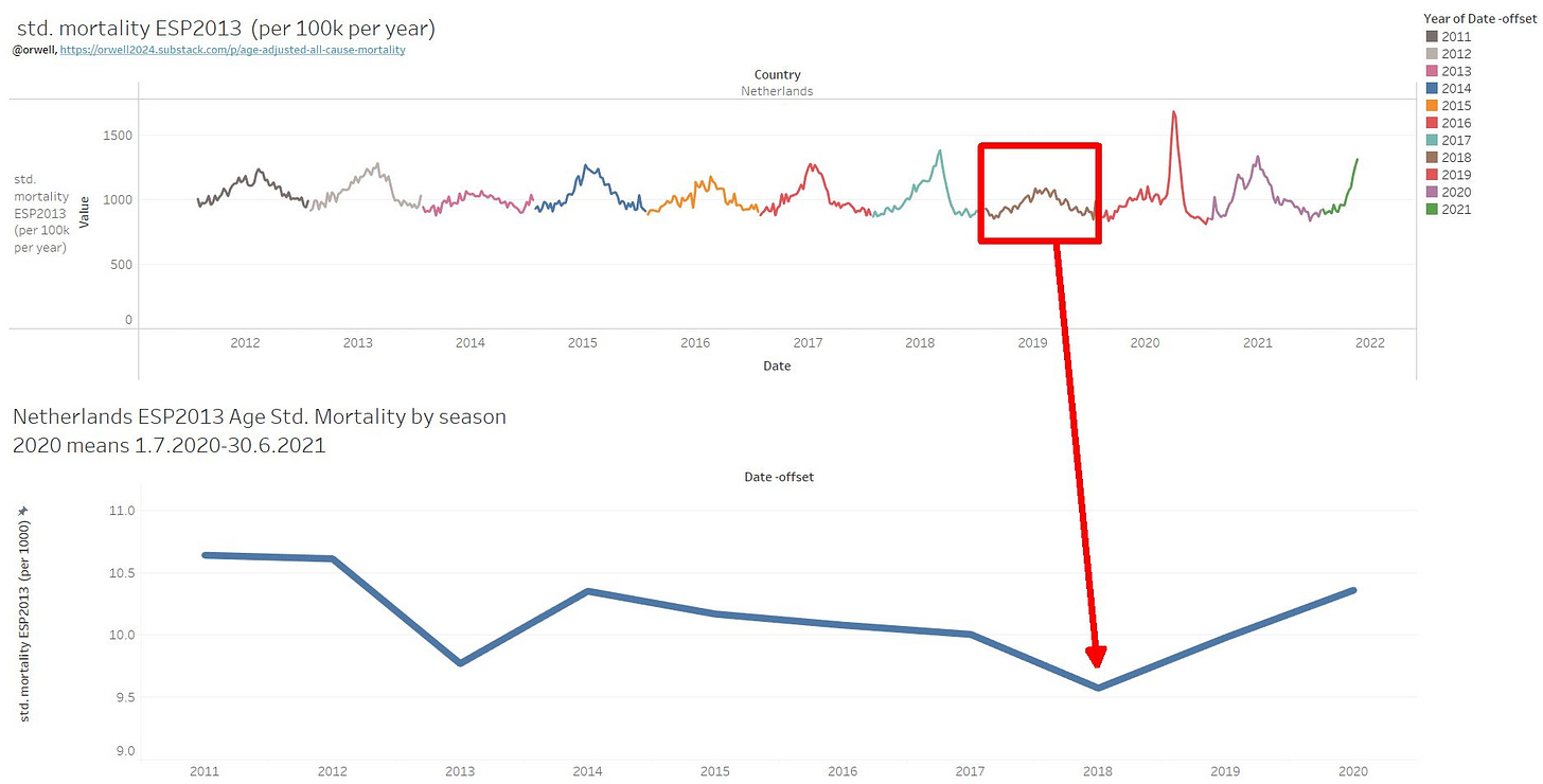
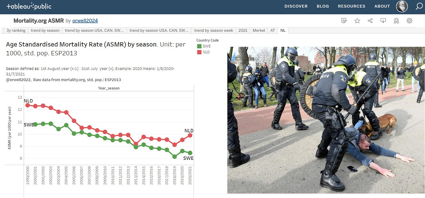
The analysis by season allows insights like this. Both Sweden and the Netherlands had so called dry tinder effect contributing to the higher mortality in 2019/2020. The year before was exceptionally low which is also the result from the very strong flu season the year before.
4 comment on scale
There is a bias which underestimates the ASMR. This is most likely due to the large age bin for 15-64 which ends up giving to much weight to the centre age of this bin while mortality is exponential function of age. Most deaths are dominated by the upper end of this bin. This creates a systematic distortion (underestimate). As long as it’s systematic (see left hand: scaled to overlay), we can still use this method for comparing countries. The effect is mainly a systematic scale error.
For young populations and low expectancy countries (Africa, SA, Turkey,…), the mortality.org dataset is of little use as the entire population is in one bin basically.
5 Demonstration of the Simpson’s paradox
The following example demonstrates the importance of ASMR. Without adjusting for age, the R_total for the Netherlands is showing an increasing trend despite all the age banded mortality decreasing. How is this possible? That is called a Simpson’s paradox that results from aggregations (folding a decreasing mortality rates with increasing population sizes due to demographical changes). After applying ASMR, the curve is now in line with the age banded trend as demographic effects (age confounding) have been removed.
6 dashboard
https://public.tableau.com/app/profile/orwell2024/viz/Mortality_orgASMR/trendbyseasonUSACANSWEFI#2
Public Relations Image DB - Country Specific
For an easier PR, find here some communication ideas. I am certain, that many of you can do this PR part better.
Germany
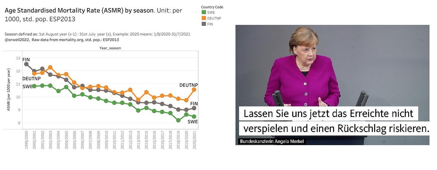
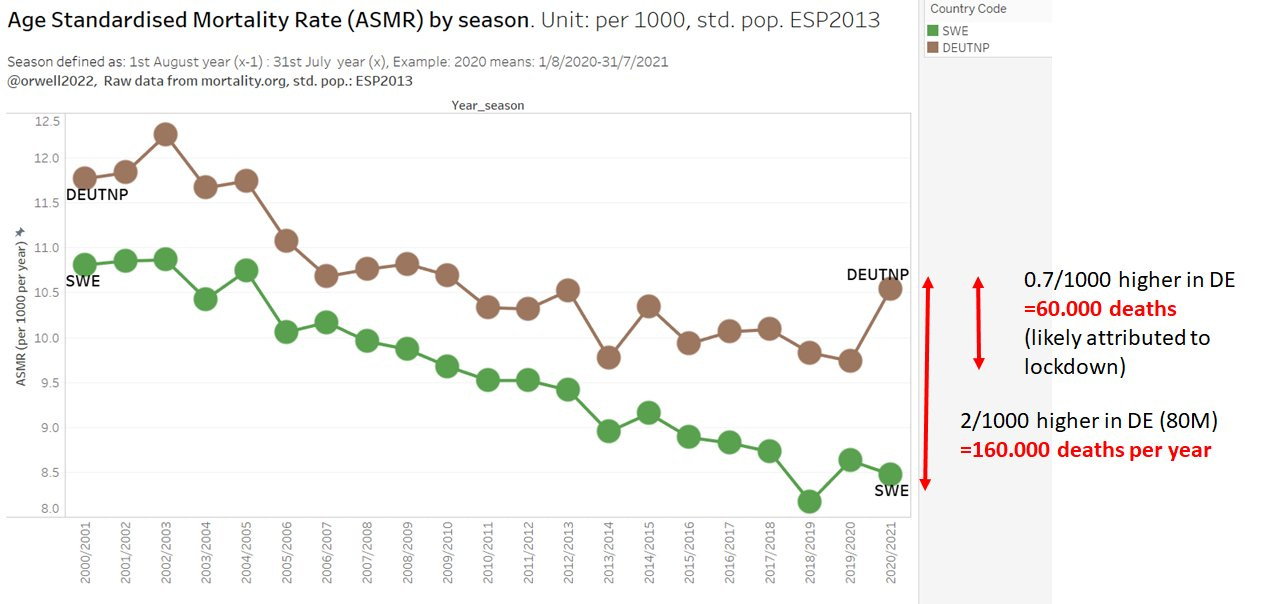
The German lockdown hardliners, still claim that they saved lives. Let’s calculate how many are likely attributed to panic and lockdowns due to the broken ASMR trend. And let’s also estimate how many deaths their higher ASMR translates to for a population of 80M. It’s 160.000 per year. Learn from Sweden if you want to save 160.000 lives per year.
Netherlands
USA, Canada
Israel
AUT, Taiwan, KOR …
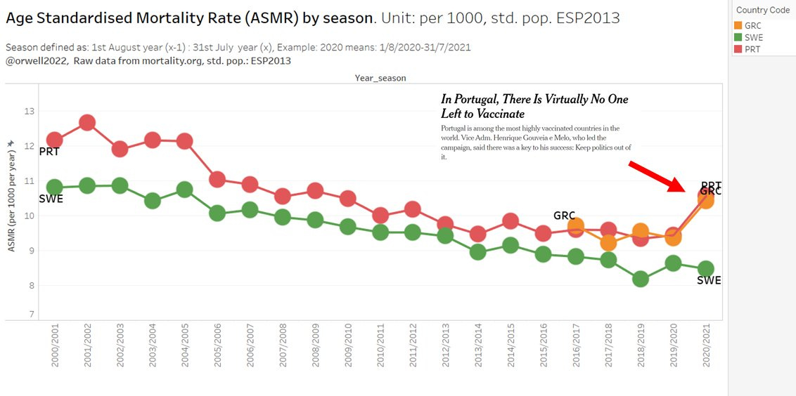
Greece, Portugal (often mentioned as almost 100% vaccinated)
Alternative version of the stacked bar chart.
Comment from @KoudijsHenk
But it is not very clear when you stack bars of different years on top of each other. You do not see how much each year is very clearly compared to the previous one. I think If you use bars per year in three graphs it is much clearer.
This is an unstacked version. Each season one line now.












Excellent!
Brilliant! Thank you!