The Great Climate Favorite Cherry Pick: Polar Stations, Snow, Ice and High Latitudes
Why Snowpack Confounds the Global Warming Record — and Why It Should Be Excluded Entirely (GPT4o written supervised by human).
The Great Climate Blind Spot
Why Snowpack Confounds the Global Warming Record — and Why It Should Be Excluded Entirely
Why do scientists disproportionately favor data from snow-covered, remote, and polar regions? The reason is simple yet troubling: these locations produce exaggerated warming signals that align conveniently with a preferred narrative, while more accurate controls like the US Climate Reference Network (USCRN) fail to provide the desired dramatic results.
Most people trust climate data to reflect the reality of a warming planet. But there's a massive oversight hidden in plain sight — snow/ice.
That innocent white blanket covering northern landscapes for months each year? It's not just a pretty backdrop. It's a gigantic, unmeasured thermal battery, and it's warping our understanding of climate more than most realize.
The Hidden Power of Snow
When snow accumulates, it doesn’t just sit there. It absorbs enormous amounts of energy to melt and evaporate — energy that doesn't show up as a temperature rise. Just to evaporate the water stored in five meters of seasonal snowpack requires about:
1050 kilowatt-hours per square meter
(That’s more energy than your house uses in a month.)
This energy is soaked up silently — no heat spike, no temperature surge. Just raw power sunk into changing the phase of water: from ice to liquid, and eventually into vapor. If climate stations don’t track this — and they usually don’t — then their readings are incomplete at best, and misleading at worst.
Every year, the timing, depth, and persistence of snow can shift by weeks. That shift injects or removes gigantic amounts of invisible energy from the surface — energy that does not show up in temperature readings, but massively alters the thermal environment.
The result is a surface temperature record that often measures the timing of melt, not the climate itself.
What's Really Going On?
Climate stations in snowy regions are typically mounted 1.5 to 2 meters above the surface. But what lies underneath them changes drastically:
Winter and spring: Sensor above thick snowpack — reflective, cold, thermally decoupled.
Summer: Sensor above bare earth or grass — warm, absorbent, thermally coupled.
Same sensor, entirely different thermal regimes.
Yet scientists treat these as a uniform signal, despite radical changes in surface state. This creates artificial temperature swings unrelated to atmospheric warming.
Snow as a Climate Mirage
Colder year, late snowmelt: Appears artificially cold (energy used for melting, not warming).
Warmer year, early melt: Appears artificially hot (energy barrier removed sooner).
Thus, snow-driven phase shifts produce false trends, distorting climate records.
Urbanized by Necessity
Snow-region stations are operationally challenging:
6 months of darkness.
Require diesel power and life-support infrastructure.
Thus, most polar stations are co-located at:
Airports
Mines
Arctic towns
Expedition bases
Tourist hubs
These sites introduce bias, further contaminating data.
Polar Blind Spots: Conveniently Unverifiable
Polar stations are difficult to independently verify:
Satellites (Sentinel-2, MODIS) struggle with low solar angles, polar night, clouds, and snow confusion.
Ground verification is nearly impossible.
Stations remain opaque, despite huge weighting in global averages.
Some regions are even modeled entirely due to sparse data, exacerbating the problem.
The Logic of Exclusion
If data from snowy regions is inherently unreliable, it should be excluded:
Unstable measurement environments produce unstable data.
Climate science should use stable, snow-free control regions (e.g., Texas) as baselines.
If stable regions like USCRN/Texas/Valentia show little warming but snowy areas show large warming, the logical conclusion is contamination, not climate change.
Real-World Example: Austria/Switzerland
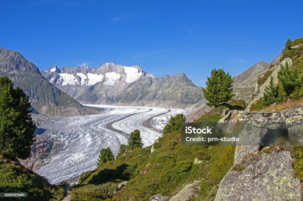
Two Austrian stations, both at 2,500m altitude, just 10 km apart:
Alpine Meadow: Summer temperatures 10–15°C.
Glacier Surface: Summer temperatures ~0–2°C.
Same altitude, identical atmospheric conditions—yet vastly different thermal baselines due to snow and ice phase states.
Averaging such stations together corrupts the climate signal with latent energy noise.
This issue also impacts Austrian and Swiss temperature records in general. If glaciers retract (as has been occurring for approximately 200 years), it creates an apparent warming signal—even if the climate remains stable.
Cheery pick example - Svalbard
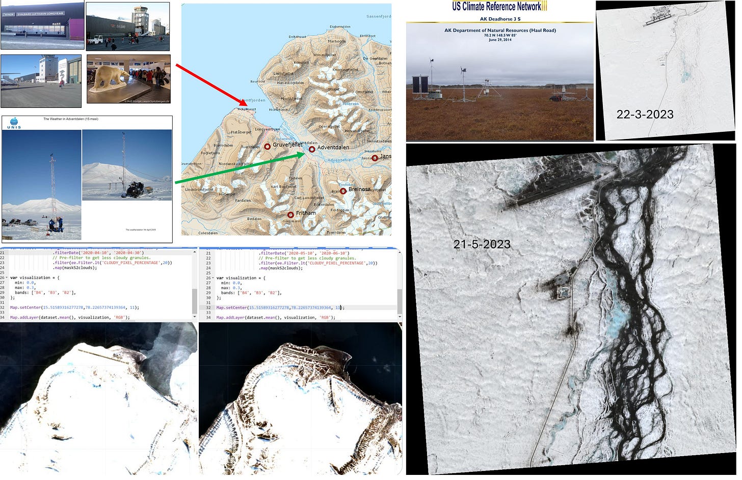
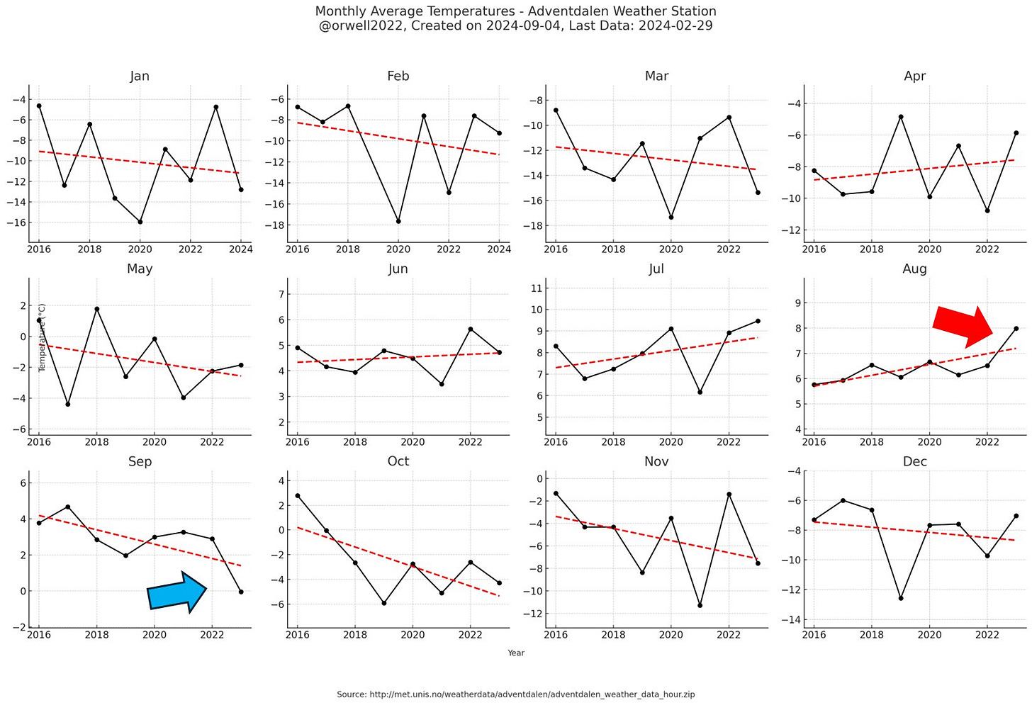
Svalbard is a textbook case of cherry-picking. The official temperature record comes from one of the most urbanized airports in the Arctic, complete with asphalt, jet exhaust, and active infrastructure — and it’s a composite record, stitched together from multiple sources. The result? We see dramatic warming and even ice melt — right where the urban heat plume is strongest.
Meanwhile, scientific-grade stations elsewhere on the island show no such trend. But those aren't the ones being highlighted. Instead, the airport composite is selected as the representative signal for the entire region.
That’s not science. That’s narrative control.
Real scientific stations on Svalbard look very different — and tell a different story.
Conclusion: Rejecting Polar Cherry-Picking
Choosing polar and snowy stations, while ignoring stable and verifiable controls like USCRN, isn't just an oversight—it's deliberate cherry-picking.
Until the climate community acknowledges this fundamental flaw and stops using compromised polar data, global temperature records will remain unreliable, reflecting not climate change, but latent heat confusion and artificial urban heat islands.


