Why Is Japan Getting Sunnier? The Answer Is in the Air.

A deep dive into decades of meteorological data reveals a surprising trend: the amount of sunlight reaching the ground across Japan is increasing. So, what's going on? Let's dig in.

Verifying the Trend: Is This a Statistical Fluke?
Before drawing any conclusions, we need to be sure the trend we're seeing is real. Maybe we (well... Gemini) made a mistake with the "anomaly" calculation?
For transparency, here's how it works. We start with the official annual data for a station like Hiroshima. The anomaly calculation does nothing more than shift the whole graph up or down so the modern 1991-2020 climate average sits at the zero line. That's all anomalies do. This simple vertical shift lets us focus on the pattern of change over time, rather than the absolute values, making it possible to compare different datasets on a common scale.
As the collage below shows, the pattern for Hiroshima perfectly matches the overall Japan average.

But is Hiroshima an outlier? Not at all.
The same distinct pattern—decades of "dimming" followed by a strong "brightening" trend—appears across the country. From Sapporo in the north to the industrial heartland of Tokyo, Nagoya, and Osaka, the signal is consistent and widespread. The trend is real.

Following the Clues: Industry, Science, and a Geographic Fingerprint
So, if the trend is real, what's causing it?
We're not the first to notice this. The people whose business depends on the sun—the solar power (PV) industry—are well aware of this brightening trend and factor it into their performance calculations. They see it in their data too. (Source: E-Solar Co.)
The data comes from sited instruments (e.g. pyranometers). (Methodology: JMA)

But here's the most compelling clue: the "dimming" wasn't uniform across the country. The effect was most intense over Japan's major urban and industrial centers, which were the biggest sources of air pollution in the mid-20th century. Decades later, these are the exact same areas that have brightened the most.
This geographic fingerprint points directly to aerosols—tiny particles from burning fossil fuels that block sunlight.

Ruling Out the Sun
We have a strong case for aerosols, but we must rule out the primary alternative: what if the sun itself is simply getting stronger? To check, we look at the Total Solar Irradiance (TSI)—a direct measurement of the sun's total energy output.

The sun's output follows a very regular ~11-year cycle of activity. You can see the peaks and valleys clearly. While the most recent cycle is very strong, this short-term solar variability simply cannot explain the decades-long "dimming" and subsequent "brightening" trend we see on the ground in Japan.

The Final Verdict: It's In Our Atmosphere
So, let's put it all together.
The brightening is most likely caused by a combination of two factors:
Cleaner Air: Fewer sunlight-blocking aerosols from industry and transport mean more of the sun's steady energy now reaches the surface.
Changes in Cloud Cover: Long-term shifts in cloud patterns can also play a significant role.
The 11-year rolling average for both datasets is chosen specifically to average out the Sun's natural cycle, letting us see the pure underlying trends. They could not be more different.

The conclusion is clear: the driver of change is here on Earth, not in the Sun.
This is not a story about solar physics; it is a story about industrial progress. The initial "dimming" was an unintended consequence of a nation rapidly building its industrial might. The subsequent "brightening" is a testament to the engineering and innovation that followed.
It is a remarkable story of capitalist-driven competence, not green/socialist politics.
https://github.com/orwell2024/JMA
https://github.com/orwell2024/JMA/blob/main/jma_all_stations_tidy_20250618.7z
One more thing…
You didn't seriously think it was over? We could have used our brains, looked at the units, and seen that the minuscule TSI anomaly (in W/m²) could never explain the huge ground anomaly. (doubts about TSI accuracy, btw). Same units now.

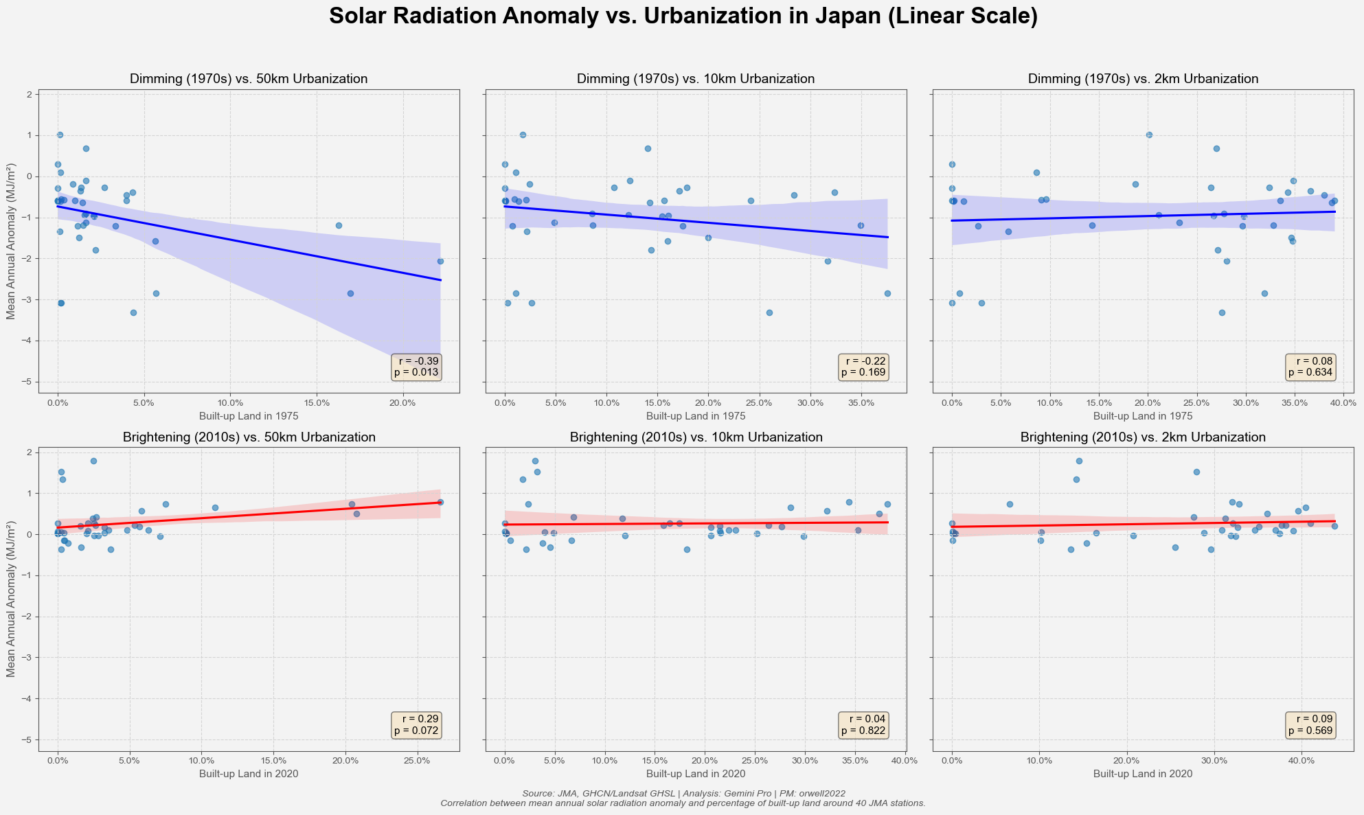
So just one more check. The hypothesis: the "dimming" was strongest in the most urbanized areas.So, the 1970s dimming anomaly should correlate with the 1975 urbanization data (at the 50km scale), right? It does... a little.

It only works with massive urbanization. Only the 50km box gives the correlation. We saw it on the map.