As a follow up from the article yesterday, we will now take a look on two particular countries. Sweden and New Zealand.
New Zealand is a remote island, with favourable climate with respect to seasonal respirator diseases. The total number of inhabitants on the surface of Europe around New Zealand is 0.005B (there is nobody except New Zealand there)
Sweden is located in a highly populated region, European continent. It has close to 1B inhabitants. Sweden is further located in a high latitude, which a hostile region with respect to seasonal diseases. Within Sweden, most people live in the southern part and coastal areas. Northern parts are basically unpopulated. At some point in the north, it simply gets too hostile for the average person to live there.
Another important point is the hemisphere. Sweden and New Zealand are shifted in seasonality by 6 months. While we have Winter in Sweden, there is summer in New Zealand now. Why would they be scared about respiratory diseases now and impose a lockdown?
Seasonality of mortality rates
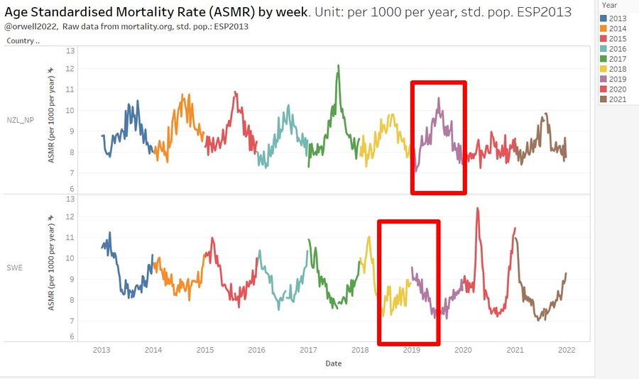
Respiratory diseases follow seasons. They always have and will, despite the claims by the Covid experts like @c_drosten et. co. It’s immediately visible if we plot the weekly mortality rates over some years. Interestingly, the seasonality is not that much weaker in New Zealand despite having such a great location and climate.

The seasonality becomes even clearer when showing this by calendar weeks. The inclination of the earth makes this happen. Seasons on the other hand modulate the UV light exposure, temperature and humidity. Those parameters all drive respiratory diseases. The main parameter is likely UV. It is responsible for vitamin D and as well hostile towards viruses. In summer, viruses have therefore limited influence on mortality. They get hit twice: through direct UV exposure, and through a higher resilience (higher vitamin D levels).
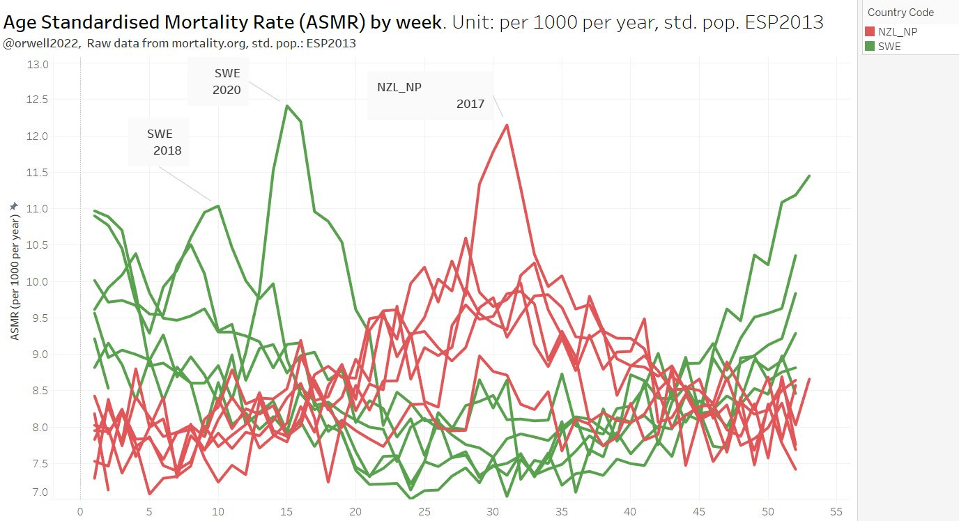
Notice the very heavy seasons 2017 in New Zealand. It compares with the original Covid-19 Swedish peak in 2020. Why was there no general panic in NZ in 2017? Why no lockdown? Why were there no removals of freedom, implementation of QR codes, vaccine mandates, etc.? Does the NZ Covid response appear rational when comparing with Sweden in 2020?
Yearly mortality trend comparison
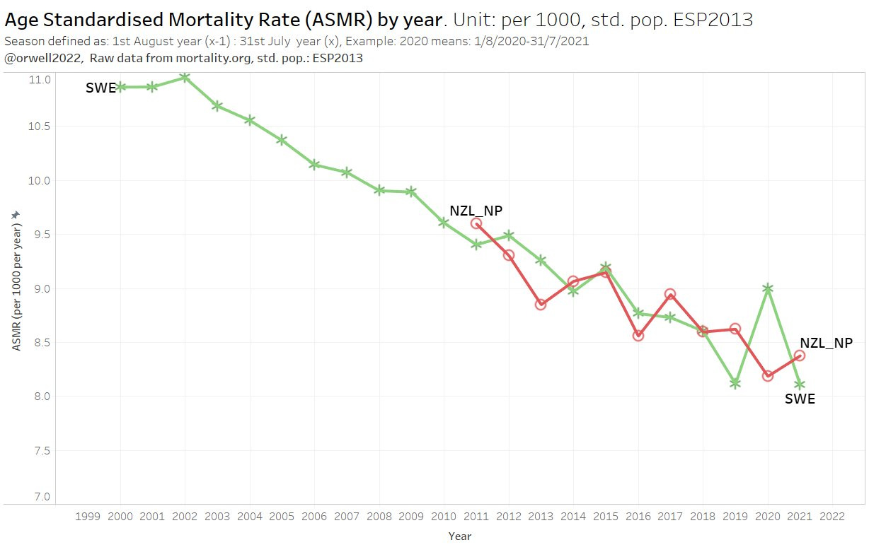
In the following we compare the yearly ASMR trend. Note that for new Zealand, the calendar year is also the natural flu season year. For Sweden, we need to shift the date by +/- 6 months.
If we wanted to compare yearly trends on a fair basis, we need to do this by flu season for both countries. For Sweden, we need to shift the date by + or - 6 months. Backward is likely better, as diseases will start in the northern hemisphere. NZ will probably lag in every season (they get it last).
Comparing north and south hemisphere gets a bit tricky when using date aggregations. But some classic MGMT style PowerPoint engineering (and transparent colours) works wonders here.
SWE is green and the calendar is shifted backwards 30 weeks to allow aggregating 52 weeks by flu season. NZ is red an according to actual date.
Do we see the greatest pandemic in history? Without the mass deployment of PCR testing, we probably would not have noticed a big difference to 2017. This has been said by many. I am coming to the same conclusion in this case.
The direct comparison with Sweden, a country located in a challenging climate with respect to seasonal diseases, clearly shows that NZ is advised to discontinue their irrational Covid response.
2017 - record mortality in New Zealand revisted
As we saw above, 2017 is immediately standing out in New Zealand’s mortality. So what happened. Let’s first show how big it was. Looks comparable to Covid-19 in Sweden 2020.
Why was there no panic and why didn’t New Zealand react like in 2020? Let’s see what we find about this exceptional year 2017 in the media. The following article summarizes it.
The quotes sound very familiar. The difference in 2017 versus 2020 is a rational approach in dealing and accepting compared to mass mania in 2020-2022.
"We had a large number of ventilated patients, we almost ran out of dialysis machines to treat patients"
"It was the busiest ICU he had worked in for years."
"ICU admissions rose by as much as 50% - the highest seen since registry records began in 1993."
At the peak, pneumonia or sepsis accounted for 16 per cent of all ICU admissions.
The conclusion is a good old grandma wisdom. It is still true today.
Staying at home when sick and hand washing are also critical to prevent the spread of flu, he said.
Let summarise my independent version of that advice in times of PCR:
asymptomatic people should not test.
symptomatic people know that they are sick and stay home until better. This also doesn’t need a test.
People in need of a treatment can be tested to support treatment / diagnostics.
Appendix
The following graph demonstrates the Age Standardisation effect. On the left we see the ASMR (Age Standardised Mortality) and on the right the crude mortality as taken from source (mortality.org). Note that this is by calendar year.
Below we do the same by flu seasons. As mentioned, NZ is naturally capturing the flu season if aggregating by calendar year. For the north hemisphere, the 52 weeks calendar week aggregation is arbitrarily capturing two partial seasons. In order to allow comparison with NZ (flu season) the 52 weeks aggregation is shifted 6 months (30 weeks, so starting week 22 and ending week 21 ) backward (we could do forward as well). Below is the seasonal comparison.
Update 1.3.2022
As mentioned in this article, the age adjustment was done using the precomputed age banded mortality rates from mortality.org. While this is convenient (normalized already, so no population data is needed), a finer age bin granularity would be better. This in particularly applies to the verly large bin 15-64 in HMD Berkley.
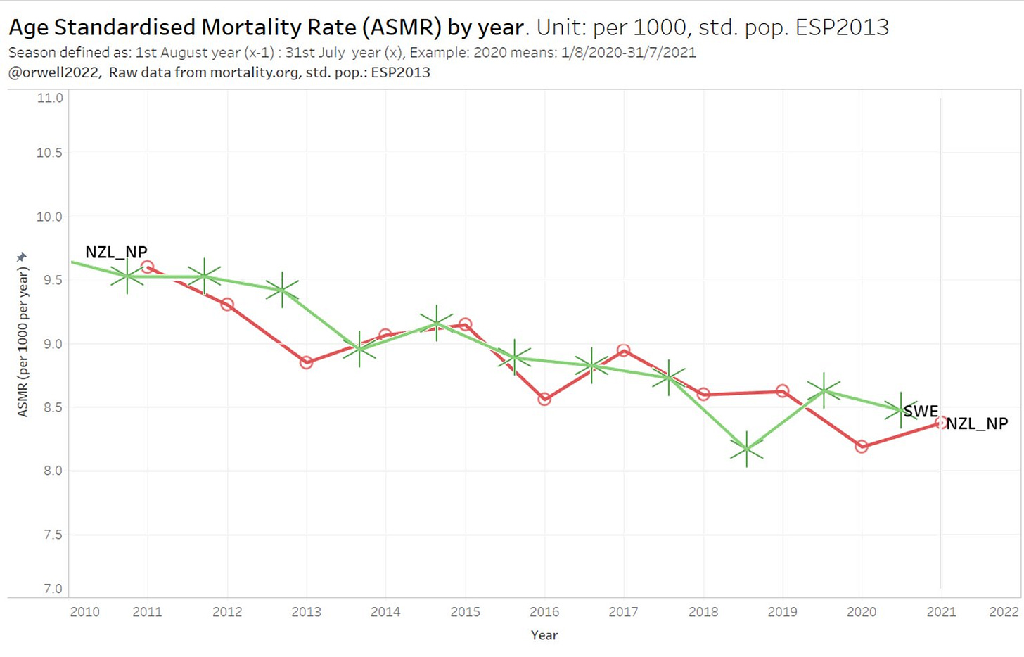
Thanks to @OS51388957 we have this data now. The below (more precise) result is done by adjusting with 5 year bins. The raw data (mortality and populations) are directly taken from the national statistic sites:
NZ:
https://infoshare.stats.govt.nz/SelectVariables.aspx?pxID=51074dc5-3c9e-482a-a825-021051412260…
https://stats.govt.nz/large-datasets/csv-files-for-download/…
SWE:
https://statistikdatabasen.scb.se/pxweb/en/ssd/START__BE__BE0101__BE0101A/
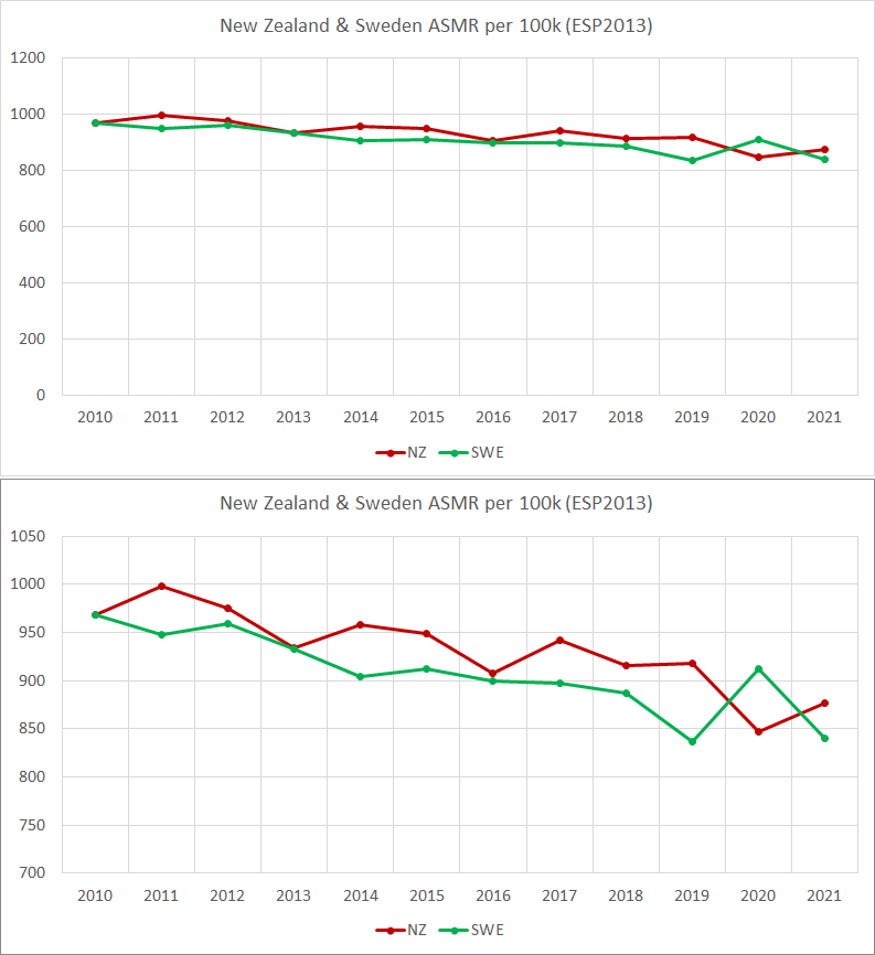
With this more precise adjustment, the results look even more in favour to Sweden. The only remark is the colour code. Sweden should be green and NZ red (which better reflects their lockdown politics).
Here again in correct colours. Thanks @OS51388957 :-)




As always - thanks for your excellent work, orwell2024. I often refer to it in my Covid-comments. See my answer to Sonny Rider in the comments here.
I'll post the link to it on the Unz Review Newslinks if you don't mind.
Btw.: Japan seems to look a lot like Sweden and New Zealand with regard to excess deaths 2020/2021.
The same is true according to the Swiss virologist Professor Pietro Vernazza if one is willing to take a statistically correct look at the Swiss numbers. So - Pietro Vernazza opposes the numbers given at the Swiss Policy Research and the government and claims there'd be hardly any excess mortality in Switzerland too during the pandemic.
Here is an article about Pietro Vernazza's take on covid and excess deaths in CH
«Ich bin ein klarer Verfechter der Impfung» (medinside.ch)
Hello Mate, Interesting article. I live in NZ. Ive started looking at our NZ Stats mortality statistics. These are monthly. I can also get the weekly registered death numbers from the NZ MOH as well.
Ive done some basic processing which is here;
https://www.dropbox.com/sh/dihwoik1305ui2d/AACZsHnPp1p6jQ-cgiIzoUV8a?dl=0
I have a 60+ sheet in the processing spreadsheet. Note: we had a more severe flu season in 2019 which you did not include - Im curious as to why???
Also Im doing comparisons year to year and also just eyeing up the general trend. Whats interesting is that in 2020 and 2021 NZ has basically had no Flu season - as we closed our borders due to the pandemic.
You will see a large decline in mortality in 2020.
Mortality then sharply increases in 2021 - despite we appear to have no flu season and suspiciously seems to occur when we start vaccinating the population.....
No data for Oct to Dec 2021 yet but Ill add when its released (hopefully over the next week)
What are other explanations to account for the increased mortality in over 60s in 2021???
Could it be lack of flu season in 2020 has added say upto a year of life for a number of over 60s??? or is it vaccine related???
Ive also done a number of comparisons looking at each year with the prior year.
I plan to add the weekly vaccine data. In september 2021 mandates started coming into effect so younger cohorts will show big increase in vaccine uptake, which could be reflected in increased deaths as well....
NZ started to vaccinate 5-12 years olds in Jan 2022 so any spike in mortality rates will start showing here as well but this will likely not be available (Jan - Mar mortality rates) until June 2022.....
Love to chat, let me know what you think??
email kiwixport@yahoo.com